Note: I have not used Imatest myself (it’s expensive). The following content is based on my subjective and intuitive understanding after observing analyses done by others.
Pipeline
sRGB -> XYZ -> CIELAB (Display) <-> CIELAB (Reference)
The test described above is for the final result (the output JPG image), not for the intermediate processes. The pipeline within the image processor affects the colours on the chart in various ways; that is to say, processes like auto exposure (AE) also influence the result.
Starting from the final output JPG image (assuming it is in the sRGB space), it is first converted to XYZ tristimulus values (using the corresponding colour space’s conversion matrix and electro-optical transfer function). The resulting XYZ tristimulus values are display-referred and normalised, meaning they are identical to the tristimulus values measured on a perfectly colour-managed or standard display, divided by luminance.
Calculating colour difference requires a uniform colour space. Converting XYZ to CIELAB also requires a reference white point ($\text{XYZ}_{n}$). For display-referred colours, the display’s white point is a common choice.
The CIELAB values for a colour chart can usually be looked up directly, or if the chart’s reflectance data is public, its XYZ values can be calculated using the spectral power distribution of a standard illuminant (usually D65) and a standard observer’s colour matching functions. Then, using D65 as the reference white point, its CIELAB values can be calculated.
Next, a colour difference formula is chosen in CIELAB to calculate the difference, such as the most commonly used DeltaE2000. Of course, CIELAB can be replaced with other uniform colour spaces or colour appearance models for more multi-dimensional comparisons.
Results and Analysis
Simply calculating the average colour difference for all colours is not sensible, as the conclusions that can be drawn are very limited (unless your sole goal is perfect colour reproduction).
White Balance and Chromatic Adaptation
In the CIELAB values calculated for the colour chart as described above, the chroma of the greyscale patches should be close to 0. Whether the chroma of the greyscale in the actual image is also close to 0 depends on the shooting light source and the camera’s white balance processing. If the camera’s white balance completely corrects for the light source (equivalent to fully adapting to D65), then the greyscale part of the colour chart in the image should also appear neutral.
However, white balance algorithms do not necessarily perform complete chromatic adaptation for all shooting environments. This also contradicts our subjective perception. The most typical example is an incandescent lamp; under such a yellowish light source, complete colour constancy is not achieved. In this case, a more ideal colour reproduction would be to retain some of the “yellowness,” i.e., incomplete adaptation. The greyscale patches in the image of the colour chart would then not be neutral but would have a certain amount of chroma.
In situations where complete adaptation to D65 is required (the greyscale should appear neutral), the chroma deviation $\Delta C$ in the greyscale area can be used to describe the accuracy of the white balance.
If the image’s white point is not D65, the target light source for white balance should be this white point. In this case, one must consider whether the incorrect chromatic adaptation transform in CIELAB will have an impact (CIELAB should ideally only work under D65).
Stylisation
Since the test image has gone through the entire image processing pipeline, it will naturally include some stylisation, such as memory colour enhancement or more complex and aggressive processing. At this point, evaluating whether the colours are “accurate” becomes somewhat unreasonable. However, one can still observe the direction in which typical colours are shifted and adjusted by comparing the standard colours of the chart with the colours of the chart in the image.
It is important to note that one should no longer evaluate whether the colours are “accurate.” Moreover, because the camera does not satisfy the so-called Luther condition, there is already a significant error when converting from the camera’s RGB to XYZ. If you train and test using the colour chart on its own, the colour difference calculated on the XYZ values converted from RAW will generally not be less than 3. Subsequent stylisation, space conversions, and gamut and tone compression will only introduce more errors. Therefore, when judging accuracy or stylisation tendencies, one needs to consider whether they are caused by errors or introduced by stylisation. The accumulation of colour difference does not always proceed in one direction; it is possible that the final colour difference becomes very small, and even cases where the difference for individual colours is less than 1 may occur. This does not mean the camera can reproduce that colour so accurately under other conditions.
When analysing stylisation, the ratio of the image’s average chroma to the chart’s average chroma can be used to observe whether the overall chroma of the image has increased. One can also observe the shift of each typical colour or convert to CIELCh and other spaces for a more in-depth analysis.
Auto Exposure and Lightness
The camera’s auto exposure strategy also affects colour difference. Furthermore, the XYZ values converted back from the final image are display-referred. Relative to the reflectance of the colour chart, the original scene’s luminance is not necessarily linear. Multiplying these display-referred XYZ values by a coefficient to simulate gain does not represent the exposure control at the time of shooting; it is more like adjusting the display’s backlight brightness (without synchronously adjusting the reference white point chosen for the CIELAB calculation). This is a very strange operation, but it can effectively reduce colour difference anomalies caused by exposure errors. In the example below, multiplying the XYZ values by a factor of 0.76 can reduce the colour difference by three units (this might only be meaningful computationally).
Therefore, Imatest also provides a chroma difference that excludes lightness, calculating only the difference in chroma without considering the effect of lightness. This seems even stranger (because operations like changing backlight brightness or exposure control also affect chroma).
Uneven Illumination and Metamerism
When photographing a colour chart, it is best to have uniform illumination. However, when using a light box, it is inevitable that the top part will be closer to the light source and thus brighter. After applying the simulated lightness adjustment mentioned above, one can observe the lightness difference. If the top rows all have positive values and the bottom rows all have negative values, one needs to consider whether this is due to uneven illumination.
The correction method on RAW data is to use a uniform surface (a grey card or matte photo paper) for calibration. However, the image has already passed through the entire ISP, and the resulting linear light is display-referred; it cannot represent the scene-referred linear light.
Regarding the issue of metamerism: the CIELAB values provided by the colour chart are calculated from its reflectance and the D65 standard illuminant. However, in reality, no light source has a spectral power distribution identical to that of a standard illuminant. The camera’s spectral sensitivity functions, after correction by a colour matrix, also differ from the standard observer’s colour matching functions. Therefore, metamerism is unavoidable. This will also lead to an erroneous increase in colour difference, because the colour chart not only evaluates the camera’s colour reproduction but also, to some extent, the light source’s colour rendering index and the camera’s metamerism.
Colour Charts and Colour Analysis
What role do colour charts really play in image processing and evaluation, and what do all those numbers in various spaces mean?
For me, the greatest value of a colour chart is that it provides 30 very typical reflectance samples, including memory colours, saturated colours, and neutral colours. The spectral data for standard illuminants and standard observers can be easily obtained, allowing for very flexible calculation of tristimulus values. This is far more meaningful than a set of CIELAB values that can only be used under D65.
This is also why using the PMCC is more recommended, as its reflectance data is published. In theory, you could even use it without owning a physical chart, simply treating it as 30 reflectance samples.
Furthermore, I feel it is highly inappropriate to make subjective colour evaluations directly from an image of a colour chart. Divorced from the physical object, the effect of memory colours should be negligible. Can one really associate a blue patch with the blue sky and perform memory colour enhancement? For an observer, it is unreasonable to judge whether colours are natural, or even accurate, simply by looking at thirty coloured squares.
Additionally, when using various colour spaces and colour appearance models for analysis, one should be precise with terminology and not casually use words like “saturated” or “vivid.” If a colour appearance model is being used, its precise colour attributes should be used for description.
Relevant data and articles about the colour chart can be found here:
M. R. Luo, “The new preferred memory color ( PMC ) chart,” Color Research & Application, p. col.22940, May 2024, doi: 10.1002/col.22940.
A Simple Example
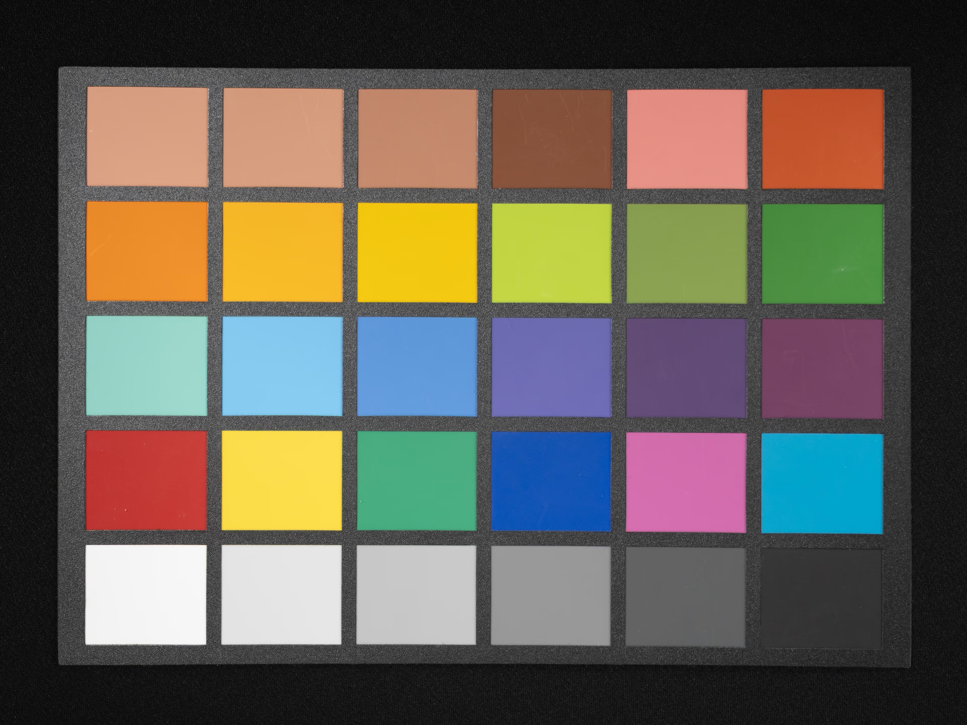
This is a colour chart photographed using a camera’s auto white balance and auto-metering. The lighting condition was a normal white LED, not a standard illuminant simulator or a full-spectrum LED.
Calculating the colour difference directly using the method described above yields an average $\Delta E_{2000}$ of 6.5. Almost all lightness values are too high, meaning the image is too bright when using the screen’s white point as the reference. After multiplying the XYZ values by 0.76, the minimum colour difference of 3.8 is obtained. This operation darkens the image without changing the screen brightness, which is equivalent to lowering the backlight brightness without adjusting the screen white point used for the CIELAB calculation.
This means that observing the image above with reduced screen brightness is identical to viewing this image without reducing screen brightness, but the calculated colour difference will be different.
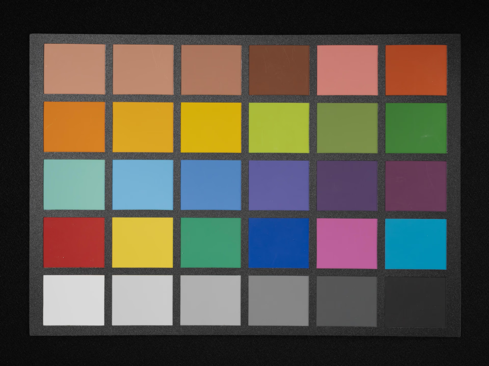
Analysis of Greyscale and Lightness
Looking at the colour difference for each colour patch, the white patch in the original image has a colour difference of only 0.83, whereas after reducing the brightness, it becomes 6.01. In the greyscale, the lightness difference between the second and second-to-last patches and their references is almost 0. The lightness of the white and black patches is lower than the reference, while the lightness of the two middle patches is higher than the reference. This implies that the ISP may contain a Sigmoid-like tone curve that increases contrast.