We have already covered the quantitative description of light, including its Spectral Power Distribution and radiometric quantities. This chapter deals with the quantitative description of colour, known as Colorimetry.
Colour Mixing
Mixing: Colour mixing is divided into additive and subtractive mixing. When lights of various colours are shone onto a white sheet of paper, they can mix to produce white light. In contrast, when various pigments are applied to a white sheet of paper, the result is black. Additive mixing is more commonly used in experiments, and it is the principle behind displays.
Matching: One half of an area is illuminated by one light, and the other half by another. If an observer cannot perceive a dividing line in the middle, meaning the two sides “look” the same, then the two lights (or their corresponding colours) are a match for that observer.
Colour and Light: Humans perceive light, which produces the sensation of colour. Light is a physical quantity, whereas colour is a psychophysical quantity. One light corresponds to one colour, but one colour does not necessarily correspond to only one light.
The Quantity of Colour: Colour is produced by light. Just as the quantity of light can be measured by radiometric quantities, the quantity of colour can be measured relatively by radiometric quantities. For instance, if the radiometric quantity is doubled, the “quantity of colour” is also doubled.
Under certain conditions, the human eye’s perception of colour mixing is linear, encompassing the following aspects:
- If two lights match, they have the same colour. If the quantities of both colours are changed by the same factor, they will still match.
- If colour A matches colour B, and colour C matches colour D, then a mixture of colours A and C will also match a mixture of colours B and D.
- If a mixture of colours A and B matches colour C, and a mixture of colours X and Y matches colour B, then a mixture of colours A, X, and Y will match colour C.
In simple terms, colour mixing is like the addition you learned in primary school, because colour mixing is essentially the superposition of light spectra, and radiometric quantities are naturally additive. Furthermore, once a match is made, it does not change with environmental variations. For example, changing the brightness or warmth of the background will not disrupt the match between the two lights on the white paper.
Although colour mixing is linear, it does not mean that the perception of colour is linear. Taking brightness as an example, while 1 unit of light added to 1 unit of light can match 2 units of light, it does not mean that a person’s perception of brightness increases linearly.
CIE 1931 RGB Colour Matching Functions
CIE: The International Commission on Illumination (Commission Internationale de l’Eclairage) is an international organisation dedicated to the study of light, colour, and illumination. The CIE has established a series of standards in the field of colour science. The previously mentioned spectral luminous efficiency function $V(\lambda)$ is one of the standards set by the CIE. Its presence can be seen in all aspects of colour science.
$$ C(\lambda) = \bar{r}(\lambda) R + \bar{g}(\lambda) G + \bar{b}(\lambda) B $$For detailed information on CIE 1931 RGB and colour matching functions, please see this excellent blog post: https://yuhaozhu.com/blog/cmf.html
For some wavelengths of monochromatic light, a match cannot be achieved. In such cases, one of the primaries must be moved to the monochromatic light’s side, and its coefficient becomes negative.
This process yields a set of curves known as the Colour Matching Functions (CMFs), which are $\bar{r}(\lambda)$, $\bar{g}(\lambda)$, and $\bar{b}(\lambda)$. In the 1920s, W.D. Wright and J. Guild, among others, obtained data through experiments. In 1931, the CIE compiled and recommended a standard set of colour matching functions, known as the CIE 1931 RGB colour matching functions.
Here, we are omitting countless details, such as whether the energy of the monochromatic light at each wavelength was the same in the experiments; the fact that the wavelengths of the primaries used by Wright and Guild were not identical, nor were they the same as the primaries ultimately recommended by the CIE, and how this data was converted; whether they were normalised, how they were normalised, and what the final units of the colour matching functions are. Although textbooks are often verbose, they choose to gloss over these points. I recommend reading the article at this link.

The function values here are called tristimulus values. The CIE 1931 RGB colour matching functions only contain data for a 2° field of view, which corresponds to the fovea of the human eye, the area where cone cells are most densely distributed. Wright’s experiment involved 10 observers, and Guild’s involved 7. This means that the experimental data from these 17 individuals laid the foundation for nearly a century of colour science, while also leaving behind potential issues and problems.
$$ r = \frac{R}{R+G+B} $$The same applies to g and b. The resulting values, where $r + g + b = 1$, are called chromaticity coordinates.
In the 1931 RGB system, when the luminance ratio of the three primaries is $1:4.5907:0.0601$, they can be mixed to produce a colour that matches equal-energy white light. Furthermore, when the matching functions are added together in this proportion, they yield the previously mentioned spectral luminous efficiency function $V(\lambda)$, meaning luminance can be calculated from the tristimulus values. This was likely the reference for the normalisation of the CIE 1931 RGB system.
Equal-energy white light: Light in which all wavelengths have equal radiant energy. In the 1931 RGB system, the tristimulus values for equal-energy white light are (0.33, 0.33, 0.33).

The CIE 1931 XYZ Colorimetric System
The CIE 1931 RGB colour matching functions were based on real primaries, which resulted in some negative values in calculations. This posed computational difficulties at the time. To solve this problem, the CIE recommended the CIE 1931 XYZ standard colorimetric system, which used imaginary primaries to not only ensure all tristimulus values were positive but also achieve other objectives.
The XYZ colorimetric system is derived from the RGB colorimetric system through a linear transformation:
$$ \begin{bmatrix} X \\ Y \\ Z \end{bmatrix} = \begin{bmatrix} 2.7689 & 1.7517 & 1.1302 \\ 1.0000 & 4.5907 & 0.0601 \\ 0.0000 & 0.0565 & 5.5943 \end{bmatrix} \begin{bmatrix} R \\ G \\ B \end{bmatrix} $$The transformation matrix satisfies the following conditions:
- In the RGB system, the spectral locus from 560-700 nm forms a straight line because short-wavelength light is no longer needed for matching in this range. It was desired for two of the new primaries to lie on this line.
- It was desired to use the Y value in the XYZ system to represent luminance, with X and Z having zero contribution to luminance. Therefore, X and Z should lie on the alychne (the line of zero luminance), i.e., $r + 4.5907g + 0.0601b = 0$.
- The final edge is a line tangent to the spectral locus at 503 nm.
- The equal-energy white point remains at (0.33, 0.33, 0.33).
The resulting XYZ colour matching functions are all positive and represent the luminances of three imaginary primaries. Among them, $Y(\lambda)$ is identical to the spectral luminous efficiency function $V(\lambda)$. The Y value is equivalent to luminance.

Normalising XYZ gives the chromaticity coordinates and luminance, $xyY$, which can be plotted to create the CIE 1931 xy chromaticity diagram.

The colouring on the chromaticity diagram is for aesthetic purposes; the points on the diagram contain only chromaticity information and no luminance information, which is why colours like grey are not shown. Because the chromaticity diagram is still linear, selecting two points on it allows for the mixing of their corresponding coloured lights to produce any colour on the line segment between them. If three points are chosen, colours within the resulting triangle can be mixed, which is also how the range of colours a display can show (its gamut) is represented. The diagram also shows that no set of three primaries can mix to produce all the colours perceptible to the human eye.
Uniform Colour Spaces
Colour Space: A mathematical representation of colour, using a few quantities (usually three) to specify a colour. For example, CIE 1931 XYZ is a colour space that uses the three tristimulus values X, Y, and Z to represent colours. Colour spaces can be linear, meaning colours can be added and subtracted, or non-linear. Different colour spaces serve different functions. In colour science, colours need to be processed in the appropriate colour space.
The Non-linearity of Luminance
Firstly, the human eye’s perception of brightness is non-linear. In an experiment similar to the matching experiment, subjects observe two colours with the same chromaticity coordinates but different luminances. Their luminances are $L$ and $L+\Delta L$. When the difference in luminance is very small, a visual match can still be achieved. When the luminance difference exceeds a certain threshold, a difference can be perceived. This luminance difference is called the “Just Noticeable Difference” (JND). The JND varies at different luminance levels, so the luminance Y in the XYZ colour space is non-uniform. A change in Y from 10 to 20 is perceived differently from a change from 90 to 100. To address this, two new concepts were introduced: Lightness and Brightness. Brightness is the perception of absolute luminance, i.e., how “bright” a light is. Lightness is the relative value of brightness, representing the perceived “brightness” of an object relative to a perfect reflecting diffuser under the same illumination. For example, a sheet of white paper has a lightness of 90 (relative to 100) whether it is outdoors on a sunny day or indoors, but its brightness will change. The goal of lightness is that for a given change in lightness value, the perceived change in brightness is the same.
Based on different experimental results, many lightness models have been proposed. The simplest lightness model is just a power function, such as Hunter’s lightness $L_H = Y ^ {0.5}$. Although lightness models vary in complexity, their basic shape is similar: in dark areas, the eye’s perception of brightness increases more rapidly, while in bright areas, it slows down. For example, the grey perceived by the human eye as being halfway between black and white has a reflectance of about 18-25%, not 50%.
The Non-linearity of Chromaticity
Similarly, if two points that are close together are chosen on the CIE 1931 xy chromaticity diagram, a subject may not be able to distinguish their colours, i.e., the difference is less than one JND. MacAdam conducted experiments where subjects performed additive colour mixing from a single colour in different directions (i.e., deviating in different directions), recording the new position when a difference could be discerned. The experiments found that these new positions could be well-fitted by an ellipse, hence they are called MacAdam ellipses.

The MacAdam ellipses plotted on the CIE 1931 xy chromaticity diagram show that the chromaticity uniformity of this colour space is rather poor, as the ellipses vary in size and orientation. Many attempts have been made to improve chromaticity uniformity. For instance, noticing that the ellipses in the upper part of the chromaticity diagram are rather elongated, one might vertically compress the diagram. However, simple transformations have not yielded satisfactory results. Notable attempts include the CIE 1960 UCS and 1976 UCS. By applying simple transformations to xy to convert them into new colour coordinates uv or u’v’, some improvement in uniformity was achieved. Here, UCS stands for Uniform-Chromaticity-Scale.
Uniform Colour Spaces
A lightness model (or uniform lightness scale) and a uniform chromaticity scale together form a three-dimensional colour space, known as a Uniform Colour Space. A well-known example is CIE 1976 \(L^*a^*b^* \), or CIELAB. It is composed of \(L^*\), which represents lightness, and \(a^*b^*\), which represent chromaticity on red-green and yellow-blue axes. Note that the asterisk is part of the symbol, and notations like Lab should be avoided to prevent confusion with symbols from other colour spaces.
CIELAB is a relative colour space, requiring a “reference white point” to be defined first. This is the tristimulus values $X_n, Y_n, Z_n$ of a perfect reflecting diffuser under the illuminant.
$$ L^* = 116 f(\frac{Y}{Y_n}) - 16 $$$$ a^* = 500 [f(\frac{X}{X_n}) - f(\frac{Y}{Y_n})] $$$$ b^* = 200 [f(\frac{Y}{Y_n}) - f(\frac{Z}{Z_n})] $$Where,
$$ f(t) = \begin{cases} t^{1/3} & t > (24/116)^{3} \\ (841 / 108)t + 16/116 & t \leq (24/116)^{3} \end{cases} $$CIELAB remains the most widely used uniform colour space today.
Colour Difference
In industrial applications, we need to quantitatively measure the difference between colours. For example, in quality control, a batch of products is considered acceptable if the surface colour difference is below a certain threshold.
If a uniform colour space exists, the best way to measure colour difference would be to simply take the Euclidean distance between two colours in that space. Applied to the CIELAB space, this gives:
$$ \Delta E_{ab}=\sqrt{(\Delta L^*)^2+(\Delta a^*)^2+(\Delta b^*)^2} $$Unfortunately, the uniformity of CIELAB is not strong enough to directly apply such a distance formula to measure colour difference accurately. In the following decades, various patches were developed to calculate colour difference in the CIELAB space. The most famous of these is the CIE 2000 colour difference formula, or CIEDE2000, proposed by M.R. Luo, with the symbol $\Delta E_{00}$. If you frequently follow digital or display technology, you have likely seen DE2000 used as a common tool for measuring display colour accuracy.
Although CIEDE2000 is computationally complex, it is currently one of the best-performing formulas across all datasets and is the latest colour difference formula recommended by the CIE.
The Munsell Colour System
Munsell was an American artist who, as early as 1905 (before the CIE 1931 XYZ system), developed a Colour Order System by summarising the experience of his predecessors and combining it with his own perspective as a painter. A colour order system is a system of colours formed by classifying and arranging various colour samples in a specific order, starting from visual perception.
From the time Newton separated white light into the colours of the rainbow, we have been able to classify colours into red, orange, yellow, green, blue, indigo, and violet. This is, in fact, a classification of colours by their Hue.
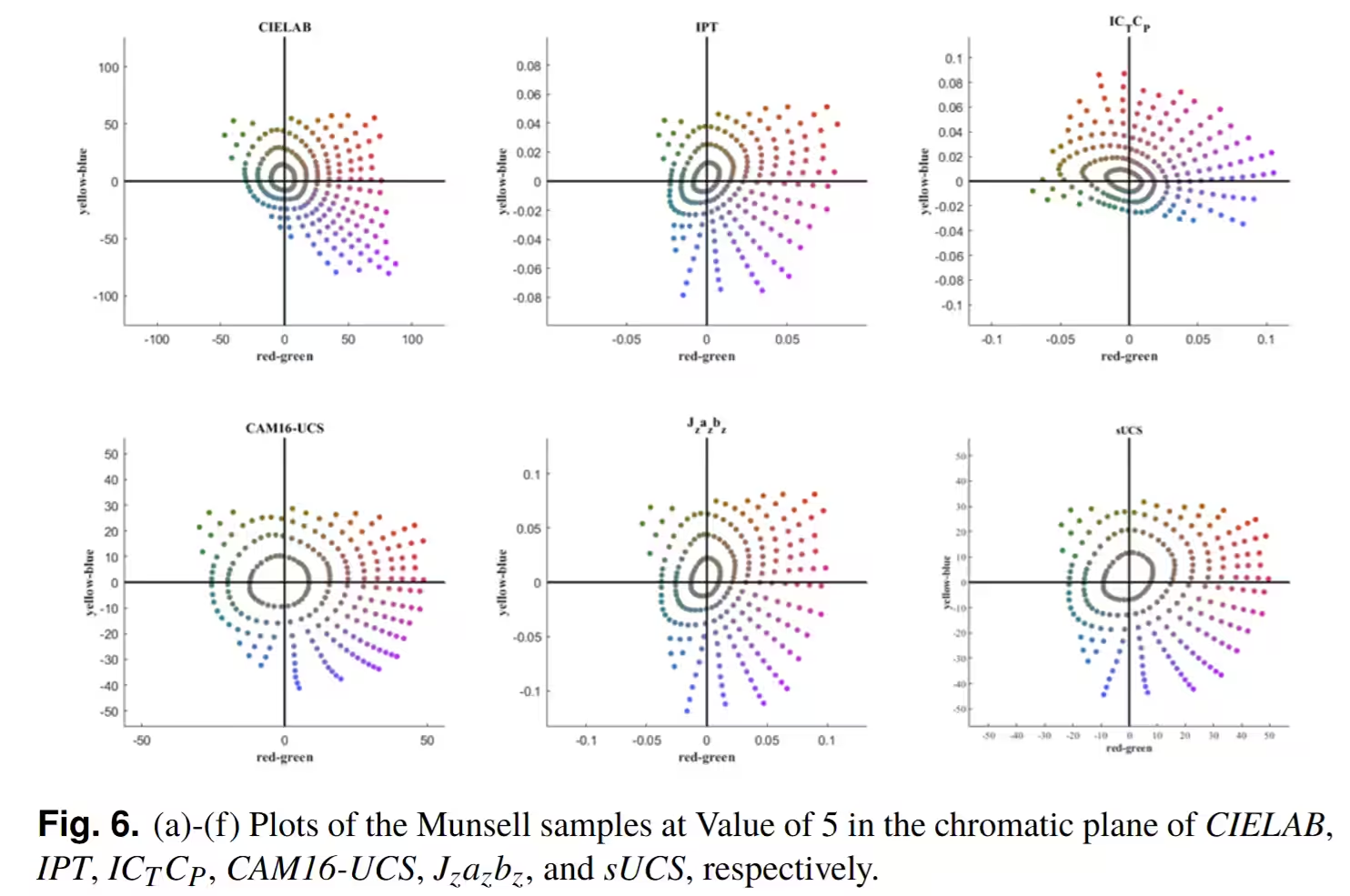
Munsell arranged colours into a three-dimensional space, called a colour solid, according to three dimensions: Value (Lightness), Hue, and Chroma. The colour chips within this solid are considered to be perceptually equidistant in all three dimensions. It is one of the most widely used colour systems today.
Because the Munsell Colour System is considered perceptually uniform, one can measure the tristimulus values of its colours and transform them into later uniform colour spaces. By observing whether the distribution of these points in the uniform colour space remains relatively “uniform”, the performance of the uniform colour space can be evaluated to some extent.
M. Li and M. R. Luo, ‘Simple color appearance model (sCAM) based on simple uniform color space (sUCS)’, Opt. Express, vol. 32, no. 3, p. 3100, Jan. 2024, doi: 10.1364/OE.510196.