Advanced Colorimetry
In previous content, we have studied colorimetry, which can quantify and calculate colour perception. According to colorimetry, under specific conditions, two colour stimuli with the same CIE XYZ tristimulus values can match. These conditions include the background, light source, material, etc. In real life, these conditions are not always met, causing two colour stimuli that are identical in colorimetry to fail to match. To address this, corrective methods such as chromatic adaptation transforms have been proposed.
With the increasingly widespread application of Cross Media Colour Reproduction, there is a need for models that can take various viewing conditions as parameters to describe colour stimuli more precisely. The colour stimulus perceived under different viewing conditions is called colour appearance. The study and modelling of colour appearance are known as advanced colorimetry, and the resulting models are called colour appearance models (CAM).
Colour Appearance
Advanced colorimetry uses colour appearance attributes to describe perceived colour stimuli in more detail. Colour appearance attributes are part of colour science terminology. All standard vocabulary related to colour science can be found at https://cie.co.at/e-ilv. From here on, it is important to use the Chinese and English terms for colour appearance attributes carefully. The index is from CIE S 017:2020 ILV. For precise explanations of colour appearance attributes, it is recommended to consult the descriptions in the international standard.
Common colour appearance attributes include: Brightness, Lightness, Colourfulness, Chroma, Saturation, and Hue.
Additionally, many new colour appearance attributes are being researched and proposed.
Related colour: 17-22-047, colour perceived to belong to an area seen in relation to other colours. This describes a colour that has a relationship with other surrounding colours. The best example is “grey”, which is always a related colour because it can only be perceived in comparison to brighter colours.
Brightness: 17-22-059, attribute of a visual perception according to which an area appears to emit, transmit or reflect, more or less light. An absolute attribute describing the degree of perceived light.
Lightness (of a related colour): 17-22-063, brightness of an area judged relative to the brightness of a similarly illuminated area that appears to be white or highly transmitting. An attribute that only related colours have, describing the relationship of an area’s brightness relative to the brightness of the brightest or white area in the surroundings.
Some books state that lightness is the perception of relative luminance compared to a surrounding white point or the brightest area; it should be relative brightness. It also does not mean that Lightness = Brightness / White Point Brightness, as they are all non-linear quantities.
Colourfulness: 17-22-072, attribute of a visual perception according to which the perceived colour of an area appears to be more or less chromatic. An absolute attribute of colour. A brighter colour stimulus may have higher colourfulness.
Chroma: 17-22-074, colourfulness of an area judged as a proportion of the brightness of a similarly illuminated area that appears grey, white or highly transmitting. Chroma is the relationship between the colourfulness of a colour stimulus and the brightness of a neutral colour under similar illumination.
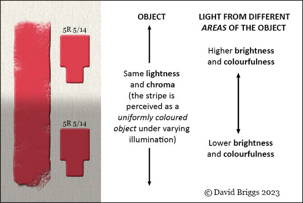
Regarding the four quantities above, due to colour constancy and cognitive mechanisms, the visual system automatically perceives the red colours in the image as belonging to the same object. In comparison with their respective backgrounds or lighting environments, they have the same lightness and chroma (it could also be said that lightness and chroma are the perception of a sample’s “reflectance” after the visual system has discounted the influence of the light source). However, the absolute attributes of brightness and colourfulness for the top and bottom colours are different.
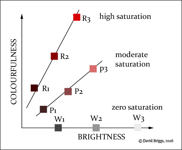
Saturation: 17-22-073, colourfulness of an area judged in proportion to its brightness. It is the relationship between a colour’s colourfulness and its brightness. The image below intuitively shows the difference between colourfulness, brightness, and saturation.
In CIECAM16, saturation is calculated from the ratio of colourfulness to brightness.
$$ s=100*\left( \frac{M}{Q}\right)^{0.5} $$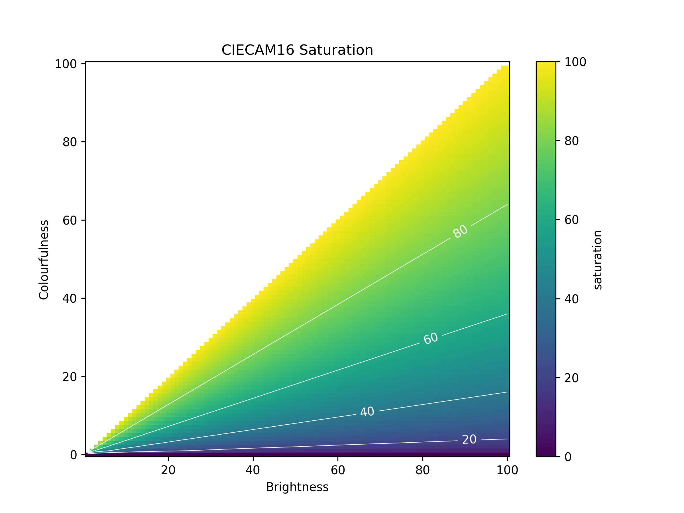
There are also many everyday words to express concepts related to “colour”, such as vibrant, saturated, chroma, or terms like Vividness and Brilliance. They all have different meanings in colour science.
Colour Appearance Models
Colour appearance models can predict the colour appearance attributes of a colour stimulus under different viewing conditions. These models typically include chromatic adaptation and the prediction of some colour appearance phenomena. Therefore, the inputs to a colour appearance model are a colour stimulus and the viewing conditions, and the outputs are various colour appearance attributes.
Inputs and Outputs
Almost all colour appearance models use XYZ tristimulus values as input, ensuring good compatibility with existing colour science. The viewing conditions, however, need to be carefully defined and usually include the background, surround, and adaptation field, among others. Additionally, a white point must be input to calculate chromatic adaptation and relative colour appearance attributes. White points are divided into a reference white point and an adapted white point. The reference white point, also known as the adopted white point, is a computationally defined white point set by a human, such as using the white displayed by a display as the reference white point in display-related calculations. The adapted white point is the white point within the visual system, i.e., what the visual system perceives as white.
The adaptation field white point refers to the white point in the adaptation field, for example, the colour stimulus of a white area in the environment. When one is fully adapted to a scene, the adaptation field white point and the adapted white point are the same.
The most fundamental output colour appearance attributes are: Lightness, Chroma, and Hue.
Basic Structure
The basic structure of a colour appearance model is:
- Convert the colour stimulus (tristimulus values) into cone responses.
- Perform a chromatic adaptation transform on the cone responses to obtain adapted cone responses.
- Derive intermediate signals (higher-level signals) based on visual theory foundations (opponent-colour theory, non-linear compression).
- Combine with viewing conditions to calculate the colour appearance attributes.
That is: a chromatic adaptation transform (but without using the inverse matrix to return to tristimulus values) + intermediate processing + calculation of colour appearance attributes.
Following this basic structure, CIELAB can also be considered a simple colour appearance model.
$$ \begin{align*} L^* &= 116 f\left(\frac{Y}{Y_n}\right) - 16 \\ a^* &= 500 \left[f\left(\frac{X}{X_n}\right) - f\left(\frac{Y}{Y_n}\right)\right] \\ b^* &= 200 \left[f\left(\frac{Y}{Y_n}\right) - f\left(\frac{Z}{Z_n}\right)\right] \end{align*} $$Here, $f(t)$ is a non-linear function used to simulate the non-linear compression of the visual system. Hue and chroma can be calculated from a* and b*. Additionally, $Y/Y_n$ can be seen as a type of chromatic adaptation transform, although from a chromatic adaptation perspective, it incorrectly applies a diagonal matrix (the von Kries hypothesis) to the tristimulus values rather than to the cone responses, resulting in its poor chromatic adaptation performance.
Due to chromatic adaptation, CIELAB-based colour difference formulae may not handle colour differences under various light sources well. This can be addressed by introducing more advanced chromatic adaptation transforms or by directly using a complete colour appearance model. You can experience related content here.
Common Colour Appearance Models
- CIECAM16: The current CIE recommended colour appearance model.
- CIECAM02: A simplified and improved version of CIECAM97s.
- CIECAM97s (the simple form of the CIE Colour Appearance Model 1997)
- Hunt model: The most complete and complex colour appearance model, developed since 1952. It has greatly influenced the CIECAM series and even considers the influence of rods.
To be continued
Some related websites: